Megaplex Movies App


Addressing a Problem
With this project I was attempting to determine how I could present users with a more direct approach to the movie trailer watching & ticket purchasing experience for movies. With that in mind I was tasked with designing an app for a movie theater that allows users to easily watch trailers, filter for content they wish to see, and step through the ticket purchase process.
Roles and Responsibilities
For this project I was the full UX designer and my responsibilities included competitive analysis, user research, conducting usability studies, paper & digital wireframing, low & high-fidelity prototyping, and iterating on designs.


Understanding the User
To understand the users who would be best served by this application I conducted user interviews to find many ways that users utilize movie applications or movie trailer oriented experiences and how those led towards the ticket buying process. The primary user group for this was those who enjoy the movie going process from trailer to seat but may need an “all-in-one” style app experience without the bloat of advertisements or other membership features.
Through this research I also learned that quite often users don’t necessarily want to be forced into the most popular movies of today and sometimes want to filter for the movies that are out in theaters, but not necessarily “front page” worthy.


From Paper to Digital
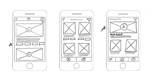
In designing paper wireframes I wanted to understand the initial “landing page” design as well as the various elements that would provide users with the quickest ability to watch a trailer & book a ticket
Once I had a concept in place I wanted to take these ideas into Figma and begin to put together low-fidelity mockups and prototypes


Usability Studies
I conducted two rounds of usability studies. One involved the low fidelity prototypes and those eventually led into high-fidelity mockups and prototypes where I was able to iterate and continue to understand the needs of users.
Through these studies I was able to better determine user needs based on designs and placement of buttons. This helped me better understand how users interact with apps and the things that may lead to confusion.

Hi-Fi Prototype
In watching users interact with the application I was left with more ideas on how to better deliver a proper purchasing experience. Users were never offered the opportunity to pick a specific date in my first iteration so I elaborated on the design as well as improved the screens to match the stylings of a movie theater application.
With the creation of a high-fidelity prototype I was able to better demonstrate that actual application process and mock up how users will actually utilize the app. It was interesting to learn more about how Figma works and how to put together a proper prototype.
Takeaways and Next Steps
Throughout this study I learned how important user feedback truly is when iterating on designs. It’s easy to think you understand the needs of your user until you get it into their hands and can effectively iterate on feedback.
Moving forward I'm learning that these designs never have to stay the same and I can always iterate to improve. My plan for this project is to continue conducting additional competitive analyses and usability studies so I'm capable of iterating further on designs.